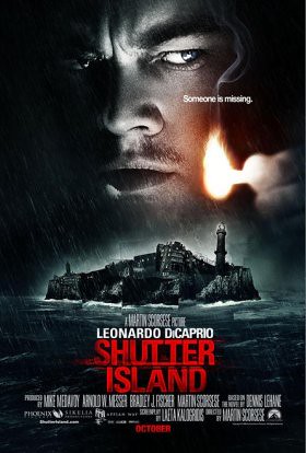
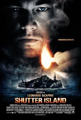
I really don't see the much of a point in this second poster. The only thing I think they've improved is the view we get of the island, which seems a bit clearer without all that rain getting in the way. But I like the color palette, fonts, and expression on Leo's face much better in the first take. They create a more ominous feeling, which fits the story well. Another note: I'm not a fan of the tagline at all. "Someone is missing" can't possibly the best they could come up with, can it?
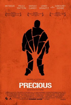
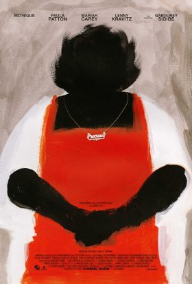
Whoever is in charge of the marketing for Precious deserves a hefty pay raise. These two posters for the acclaimed urban drama, due November 6th, are some of the best I've seen all year. I prefer the first to the second, personally, since I think it shows the state of the main character's life a little better. The second looks a little too matronly. Both get points for not relying on the all-too-common "floating heads" imagery, though.
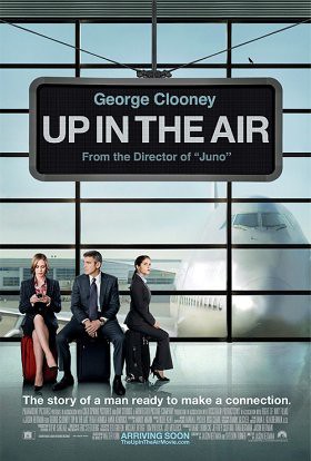
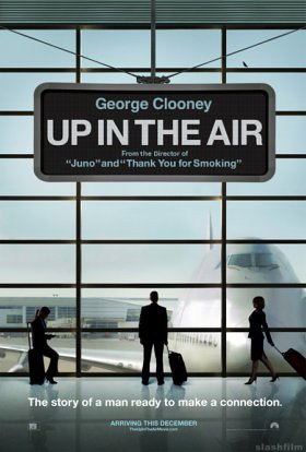
While there's definitely something a little off about the character placement in the first poster, I can't say I think the second looks much better. As a fan of symmetry, I find it way annoying that the suitcase isn't completely in the picture on the latter. I'm glad that they included a reference to Thank You For Smoking, though, since Juno isn't necessarily everyone's brand of comedy. It's appropriate also that Clooney is standing alone in the second, since a main point in the story is his character's lack of personal connections. I give the win to the second, by a hair.

0 comments:
Post a Comment